My Top Spring Colors For 2017
- Larry Witt
- Dec 6, 2020
- 2 min read
It’s officially spring! Since I’ve already covered some of my top decor picks for this season, I also wanted to share with you the colors I want to see more of! With light and airy color choices to dark and sultry, these five colors are at the top of my list for Spring 2017.
Silvery blues
Refreshing blue mixed with glamorous silver produces a fabulous color for this cheerful time of year! Shades such as Benjamin Moore’s Iceberg or Palest Pistachio are two great choices for this luxurious hue. As I work a lot with coastal interiors, this color is complementary to the lifestyle and works great at any scale, as the main color or subtle accents.
Earthy Greens & Browns (Or Golds)
A classic combination that is nurturing, warm, and sophisticated - I love combining these beautiful colors of nature. Keep your interiors down-to-earth or rich and glamorous with vibrant greenery and organic woods or jewel-toned emerald and chocolate brown. Whether you are looking for a bright pop of color or something more subdued and elegant, pairing green and brown rarely goes wrong!
Berry
Berry colored accents are ideal for spring! Playful, feminine, and romantic, this color provides the benefits of both pink and red, yet in a softer and subtler approach. Colors such as Benjamin Moore’s Razzle Dazzle, Chinaberry, and Berry Wine will all create a deliciously glam look through upholstery, area rugs, and throw pillows!
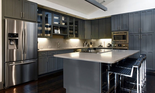
Thunderstorm Gray
Image: Nandina Home & Design
Approaching Storm, Gentleman’s Gray, and Knoxville Gray are a few of the Benjamin Moore colors that offer the best of both worlds of a gray-blue, what I refer to as “thunderstorm.” Considered a color of nature (for obvious reasons), stormy hues really look magnificent in virtually any color palette! From warm hues to cool, this dark and mysterious accent is sure to spice up your interior this season!
Subtle Pinstripes
Image via Michelle Yorke Interiors
Technically not a color, pinstripes are a way of using subtle hints of color to create a classic look. It is often found in white and black or white and navy. Pinstripes work unbelievably well with clean, tailored contemporary pieces and bring an elegant and masculine feel to a space. I love Michelle Yorke’s use of pinstriped chairs in this dining room, they’re extremely subtle but the small detail makes the dining room incredibly refined. Brighten up your home’s furnishings this spring with similar textiles, from dining chairs to bedding to wallpaper!
Express your love for spring by adding one of these approaches to color in your interior! No matter if you make a big gesture or a small one, these colors will add something exciting to your design. If you’re looking to make a bit more changes to your home, check out my previous blog on spring decor trends!


Comments